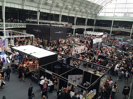
Let’s face it. Most trade show graphics are boring and uninspiring. They just sit there and do nothing. But still, you cannot leave them out. Using graphics on your trade show displays is like a de facto norm of the industry.
Thankfully, there’s a better way. Make your graphics work for you. All it takes is a little innovative thinking. If your graphics draw eyeballs in less than 5 seconds, you win half the battle, says an expert at New York Banners, a leading banner printing company that offers a wide variety of retractable banner stands. So here are 4 useful tips on how to make your trade show graphics stand out.
1. Consider viewing distance
Not all visitors look at your banners from the same distance. You’ll probably use multiple banner display stands to ensure something for everyone. The size, location and positioning of your banners should vary too. When creating graphics for a banner, consider its size, where it will be placed, and its viewing angle. The purpose of long range graphics is to get your booth noticed, while short range graphics mainly aim to provide details about your company to the visitors who have already stepped into your booth. For this job, you can use a combination of horizontal & vertical banner stands, with bullet points to highlight your USPs.
2. Use relevant images
Your image should complement your text message, and vice versa. Together, they should help create a unique visual identity. If you cannot find a relevant image, repurpose the graphics on your brochure, flyer or other marketing materials. But make sure you’re using high resolution or vector images, so they don’t look blurry or pixelated, when enlarged to fit into your backdrop banner stand. If you are planning to put text over your image, make sure both are clearly visible. It is always a good idea to use one large image rather than using multiple photos on your custom banner stand.
3. Get your typography right
It is tempting use fancy font styles, but they can distract your viewers from the main design. That’s exactly why expert designers often stick to serif or sans-serif fonts. Also, don’t use more than two font styles in a single banner. Avoid using text in all caps. Instead, use a combination of upper and lower case fonts. Choosing the right font size is also important. One rule of thumb says that if the viewer stands three feet away from your banner, your font size should be one inch. For every three feet additional distance, enlarge your font size by one inch. For instance, if the distance between the viewer and your custom banner stand is six feet, you should choose a font size of two inches.
4. Create a flow
Just because you are using multiple banner stands doesn’t mean you should communicate multiple messages. Even if you use five different graphics in five different banners, you should find a way to tie them up. In the end, they all should help tell a single story.
Finally, leave enough white space between your images and text to make your message easy to digest. Also, use lines and shapes to highlight the important parts of your message.


